Humanity is endowed with a unique gift: the ability to see and distinguish colors. At the dawn of its development, people came to understand that a different color somehow has a special effect on a person. Even the ancient Roman legionaries, to intimidate the enemy, wore scarlet tunics. The ancient Egyptians placed a sick person in a chamber painted in a certain color to heal from various ailments. Guided by thousands of years of experience and connecting a modern research base, we will study what is the psychology of color in interior design.

How to apply the psychology of color in interior design of your home?
Today’s medicine widely uses the methods of color therapy. Many people know from personal experience that being in one room brings joy, and from another one wants to run away as soon as possible. The color scheme of the environment influences the state of health, influences the emotional background, and regulates appetite. In a yellow room, brain activity improves, and light shades of green can put you to sleep. Applying color psychology to design is not only an exciting process but also requires some knowledge. Especially when you make a color selection for your own home.
Psychology of color in the interior design: how to choose your own shade?
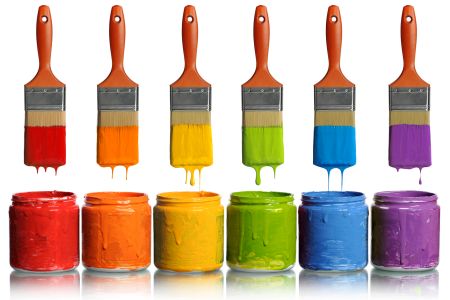
Surely, the reader saw how designers use some kind of multi-colored circle when choosing the range of the future interior. We will also delve into the basics of color. In theory, all shades of colors are obtained from three basic ones: blue, red, and yellow. From the lessons of the fine arts, remember that by mixing these colors, we get three more – purple, orange, and green, called secondary. Mixing primary colors with secondary colors gives 6 more shades of new colors.
These 12 colors are included in the so-called color wheel. To maintain harmony, they need to be chosen according to triads: blue-red-yellow, purple-orange-green, and three shades that are in a circle next to them. In addition, diametrically opposing colors harmonize: yellow and purple, orange and blue, red and green.
With theory, everything is clear, how to choose a shade that is right for you? First of all, let’s define the functionality of the future room. The nursery cannot be the same color as the kitchen, and the working area should be diametrically different from the color of the bedroom.
Choosing a color for the interior of the rooms
And now let’s talk about the features of choosing a particular shade for the design of the room

Psychology of yellow color in the interior design
Yellow, sunny definitely has a positive effect on its owner. The psychology of yellow, which prevails in the interior, enhances the brain’s ability to think logically. It activates the gray matter, which is responsible for memory. Scientists have proven that shades of yellow enhance the ability to concentrate on one type of activity.
People who choose yellow are easy-going, cheerful, and appreciate the humor. Optimists who find positive moments in everything, it is difficult to offend them. They are busy with self-education and easily cope with logical tasks.
The yellow color of the walls in the interior has a positive effect on human psychology, so feel free to design your home in this color – it will not let you sit idly by, therefore it is preferable in places of active activity. It’s a paradox, but gold in the bedroom is a real find. Even a gloomy morning will not make your awakening bleak. Yellow will help your child focus on their homework. If you are not struggling with excess weight, feel free to add yellow to your kitchen color.
Psychology of pink color in the interior design
Pink in the interior is one of the most worthy options. Do not be afraid of stereotypes that pink is only suitable for windy blondes. Many people avoid rosy environments for fear of appearing frivolous. The psychology of pink is femininity, maturity, and friendliness. Taking an extraordinary approach to the placement of accents of pink, it will turn out to decorate any room. Experiment, the fuchsia cuisine is bright and positive. Do not forget to consult with your household, not all apartment residents can support your choice.
Psychology of blue in the interior design
The color of the bird of happiness brings calmness and confidence to the house. The psycho-emotional state will find its balance. This will help in doing important things. Light blue shades are good in rooms where concentrated work is taking place. Also, blue is preferable in the design of bathrooms, here it is in harmony with the element of water and has a calming effect. Use with caution in the sleeping room, as awakening can be unpleasant.
Psychology of green color in the interior design
In psychological perception, green is a symbol of security. An example is a traffic signal indicating traffic safety. Green is used to treat claustrophobia. Green relieves eye strain. Turquoise gives a sense of belonging to the surrounding nature, where everything has its place and harmony reigns. Psychologists recommend taking a closer look at the green. It is undeservedly little used in the interior. Meanwhile, the tones of green will fit into any room in the home and will contribute to creating comfort. An exception can be a large number of dark green tones – such a color of the room leads to despondency and melancholy.
Psychology of black color in the interior design
In our usual interpretation, black is associated with mourning. Let’s break this stereotype: imagine black as a starless night or views of space. Immediately, the sorrow leaves, and something mysterious and intriguing appears. Inhabitants of the Land of the Rising Sun generally consider black as a symbol of experience and wealth, and white as a mourning color.
But the craving for everything black, from the psychological point of view, can create the impression of impending depression. The main thing here is not to rush to conclusions. If your little daughter, all of a sudden, refuses to wear a pink dress and puts on a black T-shirt and jeans, then this does not mean that the child is in danger, maybe she is just imitating her older sister.
Using black when decorating the interior, the main thing is not to cross the line between sophistication and worthless pathos.
Psychology of white in the interior design
White means calmness and spirituality. He is able to energize the occupant of the room. When in doubt about choosing a color for your home, choose white.
The other side in the perception of white is loneliness and spiritual emptiness, and excess causes a person to feel his own inferiority. In design psychology, it is recommended to dilute white with tones of gray-blue or add orange.
In order not to get a negative effect, white is diluted with bright colors, and it itself serves as a background, increasing the brightness of the environment.
White is suitable for both small rooms and layouts with spacious rooms. If the entire interior is decorated in white, you get an analog of an intensive care unit. Dilute this sterility by using, for example, pearl, milky or bleached wool. And, of course, add a couple of bright spots.
Psychology of brown in the interior design
Brown is the color of endurance, hard work, reliability, and common sense. Associated with earth and wood, it adds a sense of confidence and helps to value your time.
The flip side of the coin is boredom, frustration, and fear. It all depends on the semitones, to which shore your boat will be driven.
Brown is appropriate in any room. Use shades ranging from mouth-watering crème Brulee to deep dark chocolate. Observe the proportions: dark brown – pointwise, dosed, light colors – as you wish.
Psychology of purple in the interior design
Purple is shrouded in mysticism and grandeur. It symbolizes nobility and fills with inspiration. He will help solve any problem, as they say, with a cool head. Neutralize tension and fill the soul with energy. The violet color will dispel despair and give self-confidence. It helps to achieve a balance of male and female energy, but at the same time, purple is contraindicated for use in homes where people with mental disorders and alcohol addicts live. If you have everything in order with this, you should not occupy large spaces with this color – point accents will become a highlight of your interior.
Psychology of gray in the interior design
The use of gray has become a new-fashioned style in interiors. For a time he was discounted, considering him too dull. Today’s designers use gray eagerly. Ash walls are a great backdrop for colorful objects. It goes well with gray with pink shades and gives the surfaces sophistication and nobility.
Smoky and steel shades characterize the experience, suitable for offices and libraries. Light gray tiles, combined with a lemony finish, are perfect for kitchens and bathrooms.
An inconspicuous gray, always ready to elevate other colors, taking away their reflections, but at the same time emphasizing their dignity.
Just as in the case of brown, gray has absorbed properties of a different nature:
- Positive – compromise, stability, and rigor;
- Negative – indifference and renunciation of the surrounding world.
Psychology of beige color in the interior design
Beige is considered the color of comfort. He will never get bored, because he does not evoke vivid emotions. On the one hand, this is not bad, but there is a risk of withdrawing into oneself. Using beige in the interior, you risk nothing. It goes well with a large number of shades, there is a place for fantasy to roam. Keyword: matches. It is not worth using it as a mono color, but as a background to bright colors – please. Just like brown and gray, beige has different properties:
- Positive – stability and reassurance;
- Negative – unpretentiousness and wilting.
Psychology of blue in the interior perhaps this is the most favorite color of psychologists. It helps to get rid of many ailments associated with malfunctions in the human psyche. After all, it is not for nothing that the sight of a clear sky influences us so favorably. Any pessimist in blue interiors feels more confident. In combination with sand or yellow, blue will involuntarily transport us to the azure seashore. The psychology of blue perception is associated with well-being and optimism.
Choosing colors for the nursery
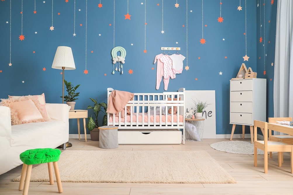
It is generally accepted that the girl’s room should be in pink, and the boy’s room should be in blue. Very boring and like everyone else. Let’s add some variety to this stereotype. To help us – the color Psychology in Interior Design of a children’s room:
- If you have a baby under three years old, we use only pastel colors with a small pattern: flowers, bears, bunnies;
- The baby grew up and became a fidget, is it difficult to calm him down? All shades of blue will help to do this;
- The child went to school, and mathematics is not given – add yellow notes to the interior. And your child will click puzzles like nuts.
What to consider when choosing a color?
First of all, the approach to choosing the color of the future interior should not be spontaneous. You must be in good spirits and not tired. If, besides you, there are other inhabitants of the housing, take into account their wishes.
#Color Psychology In Interior Design #Psychology of color in Interior Design #LovePsychologys